Working in the Collections interface (and making it work for you)
Although the Collections interface may seem daunting at first glance, with many buttons and menu options and different ways of viewing your records, you will quickly find that working with records in different Display Views is intuitive, and identifying the purpose of buttons and menu options is only a tooltip away.
This section of the Help aims to:
-
Familiarize you with the Collections interface and make you comfortable with working in it.
-
Arm you with keyboard shortcuts to many common tasks and show you where to get help on-the-fly in tooltips.
-
Demonstrate how you can make the interface work for you and, how to customize it.
Users can customize Collections in two ways:
- The information that displays in a View. As this is covered in detail elsewhere, we only touch on it here:
 Customize the information that displays
Each View has a default configuration that determines what information is displayed. For example:
- In Result set View there is a default set of columns used to display records returned by a search.
- In Record details View there is a default set of panels for displaying the full details of a record.
- In Related records View a default set of relations is displayed.
In these Views it is possible to tailor this information by adding / removing columns, panels or relations. Any changes you make to a View's settings are associated with your user account and recalled by Collections whenever you log in.
We look at how to make changes to a View's settings in:
- The look and feel of the Collections interface, adapting it to suit the screen real estate at your disposal and your own work preferences.
A feature of Collections is the ability to view records in multiple ways simultaneously. For example, you can:
- view the records returned by a search as a list in Result set View;
- open Gallery View to view thumbnails of any images linked to those records;
- select a record in Result set View or Gallery View to view all of its details in Record details View;
- open Help View to get field level help for fields in Record details View;
- open Media viewer to view and play media linked to the current record
 The record currently displayed in Record details View or highlighted (with a solid background) in Result set View or Gallery View for instance.;
 - open Related records View to identify records linked to the current record; and so on.
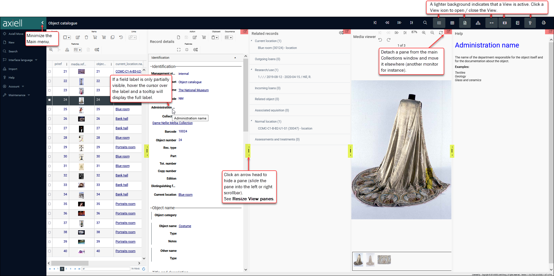
Each of these Views opens in its own pane within the Axiell Collections Window. While it can be useful to work with records in more than one View, the more Views you have open, the less information will be visible in each View as they compete for space. Five Views are open in this example and the Axiell Collections Window is so crowded that some field labels, data and Help text is unreadable:
The simplest solution, of course, is to close any Views you do not need: click an active button in the Toolbar to close a View.
With one exception, closing a View does not lose any information: for instance, you can safely close Result set View without losing the currently listed records; until you run a new search, select New in the Main menu or import records the same list of records will display when you reactivate Result set View.
The exception is Record details View. If you create a new record or edit an existing record in Record details View, do not close your browser or close Record details View until you have saved the record:
- If you were adding details to a new record, you will lose the record.
- If you were editing an existing record, you will lose your changes and the record will be locked for editing for other users.
If you find that a field label remains partially visible after closing Views, hover the cursor over the field label and a tooltip will display the full label:

Tip: If you are looking for more in-depth information about a field, use Help View.
Information about many elements in the user interface is available in tooltips. Simply hover the cursor over an element:
- Fields: the tooltip holds details of a field's system name and tag:

- Buttons in the Main menu: the tooltip will display a description of a Menu option:

- Buttons in the top Toolbar: the tooltip will display a description of the option:

- Buttons in a View's Toolbar: each View has its own Toolbar and the tooltip will display the name and shortcut (if available) of a Toolbar button:

Other ways to make space and customize the user interface to suit your needs and the size of screen you are working with:
The Main menu displays on the left of the Axiell Collections window at all times. To provide more screen real estate for viewing records, the Main menu can be minimized to show icons only:
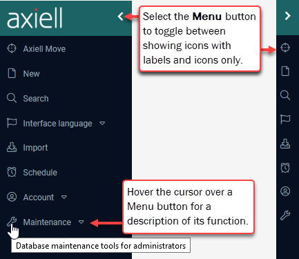
In versions of Collections prior to version 1.12, the Menu button displays as:
![]()
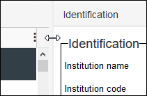
Hover the cursor over the vertical scroll bar between two View panes and when it changes into a double-headed arrow, click and drag to the left or right to adjust the relative width of panes:
A simple way to maximize one View by hiding another is to use the arrows in the middle of the vertical scroll bar between two panes (highlighted in yellow):
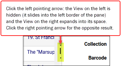
In this example the View on the left slid into the left border of the pane:
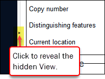
To reveal the hidden View, simply click the right pointing arrow.
By default, Views open in their own pane within the Collections Window. If a pane includes the Detach ![]() icon in its top right corner (highlighted in red in the top image), it can be detached and opened in a separate browser window. If you are working with a large enough screen, detached panes can be organized around the main Window, or moved to another monitor if available.
icon in its top right corner (highlighted in red in the top image), it can be detached and opened in a separate browser window. If you are working with a large enough screen, detached panes can be organized around the main Window, or moved to another monitor if available.
The Result set View and Gallery View cannot be detached from the main Window and they do not include the Detach icon.
Here we have detached the Record details View pane from the main Window:
Things to note:
- The current record
 The record currently displayed in Record details View or highlighted (with a solid background) in Result set View or Gallery View for instance. is always in sync in each View: changing the current record in one View will change it in every other View.
 - A detached pane is closed by clicking the cross
 in the top right corner. Next time the View is opened, it will display within the main Collections Window once more.
 - The ALT+TAB keyboard shortcut can be used to cycle between open windows (this shortcut cycles through ALL open windows: browser windows and any other open applications).
Most of these changes to the layout are forgotten when you log out of Collections: when you log back in, Views that were detached will display within the main Collections Window, and resized panes will return to their original size.
One other change that you can make to the user interface is to the size of text in the Axiell Collections Window. As a browser-based application, text size in Collections is a browser setting:
Modern browsers have a zoom option for increasing / decreasing the display of content. Typically you increase the size of all content in the window, text and graphics, simultaneously; however you should also be able to increase the size of text only. Each browser manages this differently. Refer to your preferred browser's documentation:
The following shortcuts are typically recognized by modern browsers:
- Keyboard shortcut combination:
- CTRL +
+to zoom in - CTRL +
-to zoom out
- CTRL +
- Keyboard and mouse wheel combination:
- CTRL + scroll wheel forward to zoom in
- CTRL + scroll wheel backwards to zoom in
